Mahmudul Hossain
Google Ads & Conversion Tracking Specialist
6 October 26
13 min read
Illustration by Fsdm Mahmudul
Someone walks into your shop and picks up a shirt. They feel the fabric, hold it against another size and ask whether it will shrink after washing. In a shoe shop, they might turn a trainer over, inspect the sole and try it on.
Online, those small checks are harder. Your pictures and words have to help the customer understand what they cannot touch. A clothing store website needs to answer practical buying questions, not just display attractive products.
Our conversion rate optimisation service examines where those decisions become difficult. For a local fashion retailer, the most useful improvements often begin with everyday information: fit, stock, delivery and what happens if something is unsuitable.
This guide is a working brief you can use with your team or website provider. The examples are hypothetical. They are not claims about a particular client or promises that a feature will increase sales.
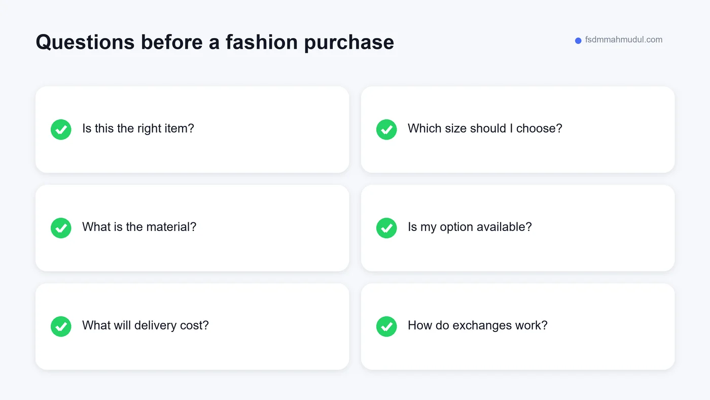
Before choosing a design, write down what customers ask at the counter. Do they want to know whether a garment is see-through? Whether a shoe has a removable insole? Whether an item can be collected today?
Those questions are clues to what the website needs to explain. A feature list written without them can miss the information that matters most. You could have a quick checkout while customers remain unsure which size to buy.
Group questions into three stages: finding an item, deciding whether it is suitable and completing the purchase. Then decide where each answer belongs. A product-specific detail should be on the product page. A general delivery rule may belong on a dedicated information page, with a useful summary near the purchase button.
Keep the list close to the people serving customers. New questions can reveal missing information after launch. Your website becomes more useful when updates come from real conversations rather than guesses about what shoppers might want.
A local shop may know its stock by supplier codes or storage locations. Customers usually think in product types, occasions, sizes and preferences. The navigation needs to reflect the shopper's language.
Start with a manageable set of clear categories. A clothing shop might separate shirts, trousers and outerwear if those categories fit its actual stock. A shoe shop might use trainers, sandals and formal shoes. Avoid splitting a small range into many nearly empty sections.
Filters should help people make meaningful choices. Size and colour may be useful when enough products are available. A filter that returns nothing repeatedly can become frustrating. Check the result for each option, particularly when stock changes.
Search can help customers who know what they want, but browsing still needs to work. Someone may not know your product name. Make sure they can follow links from the main categories to individual items without using a search box.
A title like "New Collection Item" does little to help a shopper recognise a product later. Choose a name that describes the actual item, using relevant details such as type, material or colour when you can verify them.
For example, "Women's cotton long-sleeve shirt in navy" is a possible description only if those details are true. Do not call a blended fabric pure cotton because it sounds better. Do not label a general casual shoe as a specialist running shoe without appropriate support.
Keep product naming consistent across the website and your social posts. A customer should be able to move from a video to the matching page without wondering whether they found the same item.
Use product codes as an additional identifier when they help staff, not as the only information customers see. If someone contacts the shop, a code can make finding the right product easier while the readable title still explains what is being discussed.
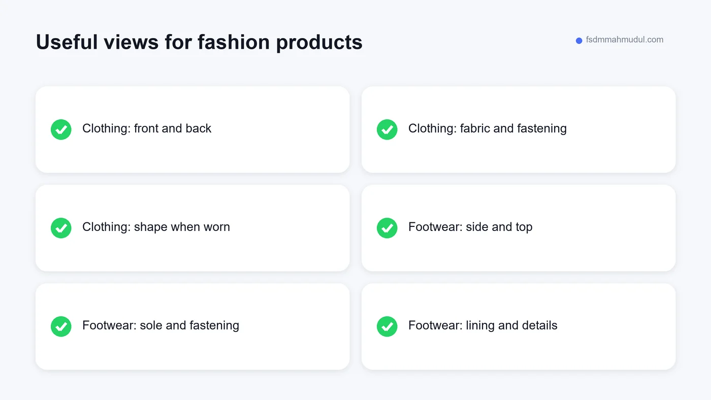
One front-facing image is rarely a complete explanation of a garment or shoe. Plan the photographs around what a shopper needs to inspect. Each additional view should show something useful rather than repeat the same picture with a different crop.
For clothing, useful views may include the front, back, fabric texture, fastening and garment worn in a way that shows its shape. For shoes, consider the side, top, sole and relevant detail of the fastening or lining.
Keep the item clearly visible and show its actual condition. Avoid editing that hides texture or changes the apparent colour. If lighting can affect how a colour looks, use consistent lighting and a straightforward written colour description.
You do not need to present the photographs as a luxury campaign. A clean, consistent set can be easier to use than heavily decorated images. Make sure customers can inspect them on a phone without a pop-up covering the details.
Small, medium and large are labels, not measurements. A customer who bought a medium from one brand may still be unsure about another. If your suppliers use different sizing, explain the relevant details for each product or range.
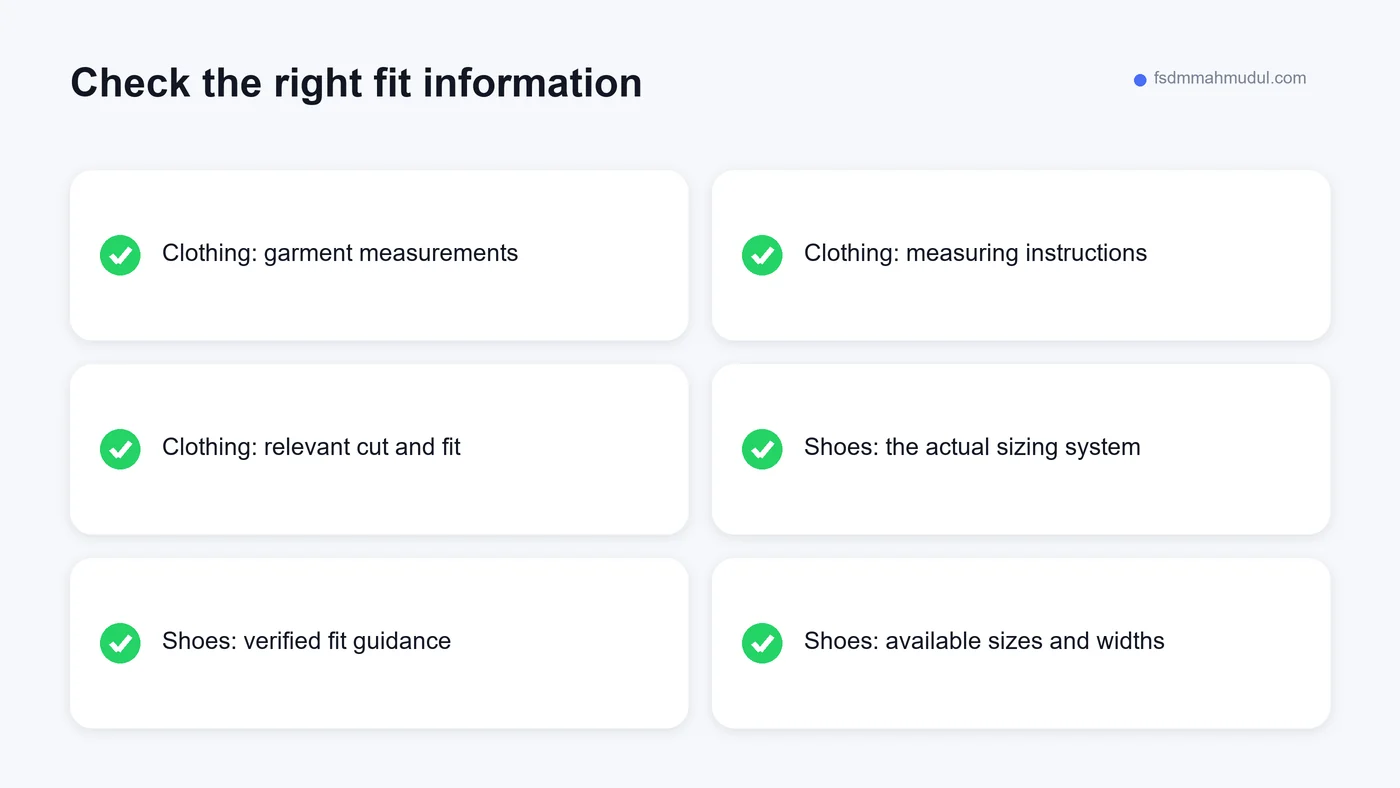
Show verified garment measurements and identify what was measured. A chest measurement taken around the body is different from the width of a garment laid flat. Without that distinction, even a detailed size chart can be confusing.
Explain how to use the chart in plain language. If you suggest comparing with a similar garment the customer owns, say which part to measure and how. Use the measurement units clearly, and keep the instructions near the size selector.
If you show a model wearing an item, provide accurate size information when it is available and relevant. Do not invent a height or garment size to make the photograph seem more useful. Missing information should be checked with the person who supplied the image.
Footwear raises questions that a clothing size chart cannot answer. Identify the size system clearly so customers know whether they are choosing UK, EU or another sizing standard. Avoid relying on a bare number without context.
Where the supplier provides verified guidance, explain relevant width or fit information. If a style is not available in different widths, do not make the selector imply otherwise. A customer should understand the actual choices.
Describe practical features you can confirm, such as the fastening, upper material or lining. Be careful with statements about support, comfort or suitability for medical needs. A product page should not make claims that the shop cannot substantiate.
Consider the customer who already owns the same model and simply needs another pair. Clear names and variant information help that person reorder. Someone trying a new style may still need advice, so keep a useful contact option available.
Products often have several combinations of size and colour. A blue shirt being available does not mean every blue size is in stock. Customers need availability for the exact combination they select.
Try selecting options in different orders. Choose a colour first, then a size. Reverse the order. Check that the page shows the correct item, price and availability each time. An attractive selector can still contain confusing behaviour.
If a variant is unavailable, show that clearly. Tell customers what alternatives exist when you actually have them. Do not offer a restock date unless someone can maintain it accurately.
Your stock process matters as much as the display. Counter sales, reserved items and website orders may all draw from the same shelves. Agree how those changes reach the website, and make someone responsible for checking that the displayed availability remains accurate.
A customer may like the product but need it before a particular event. Delivery information affects that decision. Explain where you deliver, how charges work and the difference between dispatch time and estimated arrival.
Use estimates your fulfilment process can support. A message promising next-day delivery should not appear on items that need several days of preparation. Show relevant exceptions where they affect the purchase, rather than hiding them in a long policy.
If collection is available, explain the location, process and how the customer knows the order is ready. Keep shop opening hours accurate. "Collect today" needs a reliable cutoff and a team that can prepare the order.
Local collection can be useful for a retailer, but it is not automatically the best option for every shopper. Present the real choices clearly and let the customer decide which fits their needs.
| Buying question | Useful information | Where to place it |
|---|---|---|
| Will it fit? | Verified measurements and size guidance | Near the size selector |
| What does it look like? | Different views and accurate colour details | Product gallery and description |
| Can I buy this option? | Availability for the chosen variant | Beside the purchase action |
| What will delivery cost? | Charges or a clear calculation method | Before checkout commitment |
| Can I collect it? | Location and readiness process | Delivery choices and collection information |
| What if it is unsuitable? | Actual exchange or return terms | A visible summary and policy link |
Fit-sensitive products make exchange information particularly important. Explain the actual policy and where customers can find the full terms. State relevant conditions clearly, using wording approved for your shop and consistent with applicable requirements.
Avoid a vague badge saying "Easy Returns" if the process is not explained. Customers need to know where to start, what information to provide and what happens next. Do not borrow another retailer's policy because it sounds reassuring.
Check the policy against the fulfilment process. If a customer has to return an item to the shop, your staff need to recognise the website order and handle it consistently. A promise on the page must match the experience at the counter.
This guide is about making your existing terms understandable. It is not a template for setting legal rights or refund rules. Have the responsible person confirm the policy before publishing it.
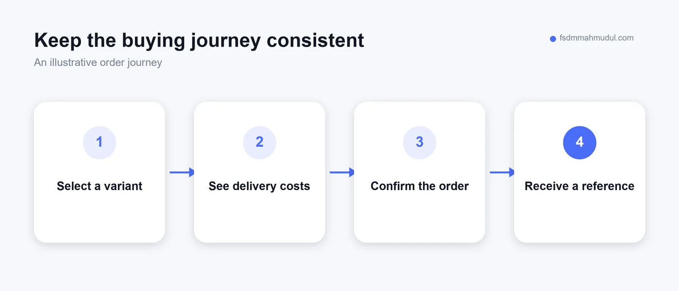
Use a real phone to place a test order through the approved testing process. Do not judge the checkout only from a large screen. Fields, dropdowns and error messages behave differently when the on-screen keyboard is open.
Check whether customers can understand why information is needed. Ask for details relevant to fulfilling the order. If an account is required, consider whether that is necessary for your buying process and explain what the customer needs to do.
The total should be clear before the customer confirms. Show the selected product, variant, delivery choice and applicable charges. A last-minute surprise can undermine the confidence built by an otherwise useful product page.
After submission, provide a clear confirmation and an order reference. Explain the next step in your actual process. The customer should not have to message the shop simply to find out whether the order was received.
It helps to see where shoppers stop, but distinguish a completed purchase from an attempt. A payment button click may happen even when payment fails. A basket action may record interest without any subsequent order.
Use your shop's order records to check the figures from website reports. Look for duplicate purchase records, missing values and test orders. Make sure the person reviewing the report understands what the main measure includes.
Our conversion tracking service deals with those measurement questions. Tracking needs to describe what really happened, so improvements are not judged against misleading numbers.
If you plan to advertise, prepare product pages and tracking together. Our ecommerce advertising work uses the destination page as part of campaign planning. A click is more useful when the page behind it can answer the customer's questions.
Readable names, descriptive categories and accurate product information help people understand your range. Search visibility should grow from that useful foundation. Do not turn every description into a repeated list of keyword phrases.
Use descriptive links between relevant pages. A guide to choosing an item can link to an appropriate category, and that category can link to the actual products. Avoid adding unrelated recommendations simply to create more links.
Google's ecommerce SEO guidance explains how product information and site structure help it understand an online shop. Implement the parts appropriate to your platform rather than adding technical features without a clear purpose.
For the wider decision about launching, read why a local shop needs an ecommerce website. That article looks at readiness, operating responsibilities and the limits of what a website can do by itself.
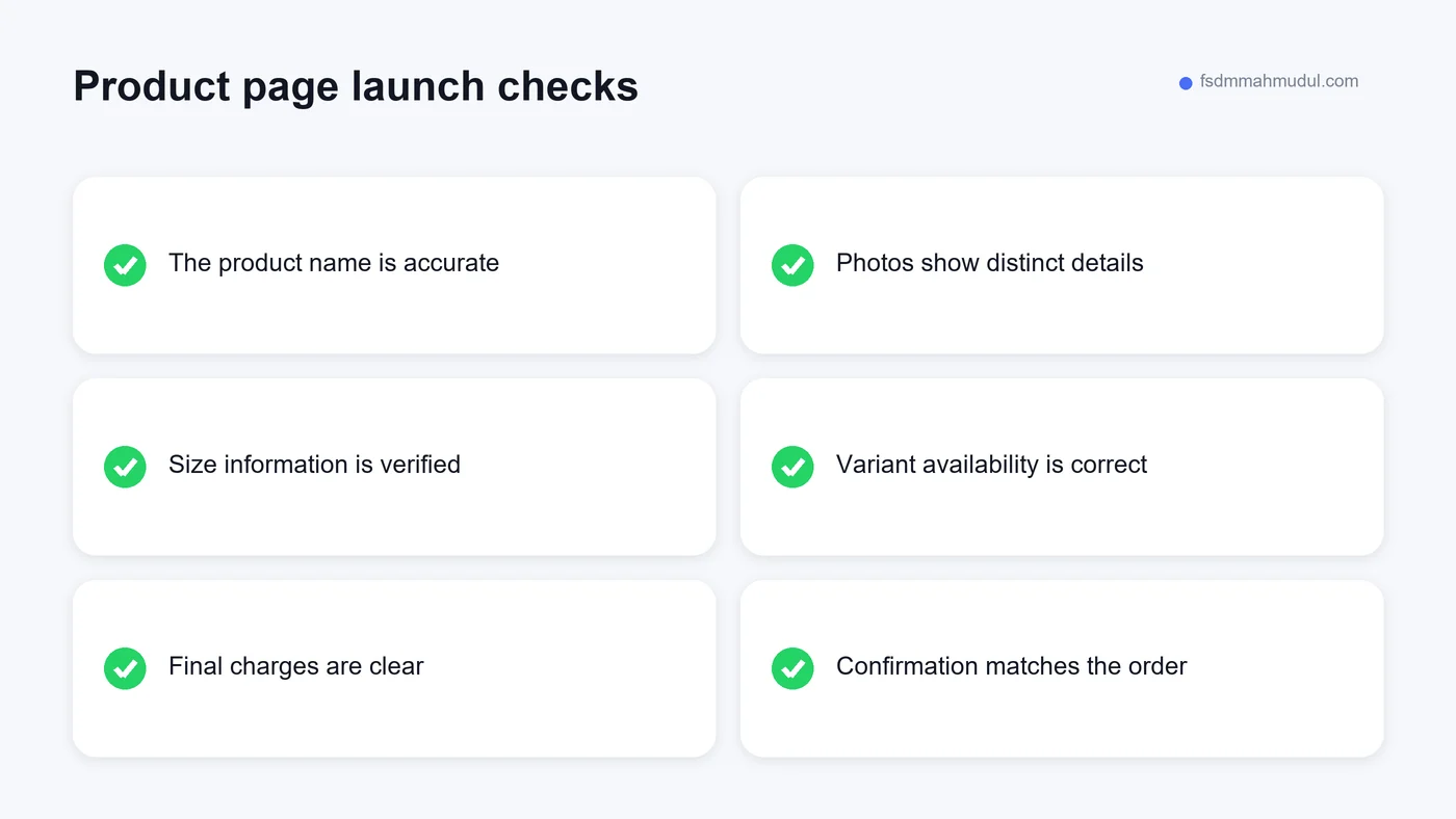
A common mistake is spending most of the preparation time on banners while leaving product details incomplete. The banner may attract attention, but the product page carries the decision. Allocate time to the information customers actually need.
Another is applying one size chart to every brand or product without checking it. That can create false confidence. If the details differ, show the appropriate guidance and make the relationship clear.
Also watch for copied delivery promises, unavailable variants and review content that does not belong to the item. Genuine evidence needs context. You can see examples of our page-review approach in the CRO portfolio, without treating those examples as predicted outcomes for your shop.
Finally, resist adding pop-ups at every stage. Before using an interruption, consider what the shopper is trying to do. A message that covers the size chart or checkout button is competing with an important task.
Enough to show the details that affect the buying decision. Choose distinct, useful views rather than an arbitrary number. A simple item may need fewer views than a garment with several details or a shoe whose sole and fastening matter.
Yes, when you have permission and the information accurately describes your stock. Check the material, variant names and sizing guidance before publication. Replace generic wording with helpful verified details where appropriate.
That depends on the process you can support. A clearly labelled catalogue can help customers browse, while full checkout can record orders directly. Do not advertise automatic ordering if the customer still has to negotiate every detail through messages.
Choose a page that receives relevant visitors and has a clear information or buying problem. Check the entire journey from that page to the order confirmation. Our website warning-sign guide helps you prioritise urgent issues.
Useful fashion product pages let people inspect the item, judge fit and understand the purchase. They also make it easier for your team to fulfil the order accurately. Start with those responsibilities and build additional features when they serve a clear need.
For a focused review of your shop's product pages, buying journey and advertising readiness, Get My Free Audit.
We can review your current setup and show which issue should be addressed first.
Get My Free AuditHere are answers to the questions people ask us most. Can't find yours? Message us and we usually reply within an hour.

We review your campaigns, tracking or conversion journey, then show you the main issue limiting performance, its business impact and a practical next step.
Yes. Most clients start from $1,000 a month in ad spend. We will tell you honestly if your budget is too small.
A dedicated specialist from our team runs your account day to day, and Mahmudul oversees the strategy and reviews the results. You always have one point of contact, so you never have to chase anyone.
No. Work is month to month and you can cancel any time.
Always. Your accounts, campaigns and tracking stay yours, even if we stop working together.
Wasted spend usually drops in the first 2 weeks. Steady growth shows by month 2 or 3.
Clients in Bangladesh, the US, UK, Canada, Australia and Europe. Our team works across time zones.
Request a free audit or message us on WhatsApp. We confirm the audit is a good fit, share our findings or invite you to a review, then agree the next step with Mahmudul.
Yes. Our tracking specialist checks that every sale, lead and call is counted correctly, because good ads need good data.
Yes. We send clear, simple notes your developer can follow, or our own developer makes the changes for you.
With a team. Mahmudul leads a small group of specialists in ads, tracking, page design and website development. Each person works on what they know best, and Mahmudul checks the work before it reaches you. If someone is away, another team member covers for them, so your work never stops.
You get a simple monthly report showing what we spent, what we got back and what we will do next. Mahmudul reviews every report before it is sent.